

A real estate management platform designed to bridge the gap between real estate agents and distributed branches across the country.
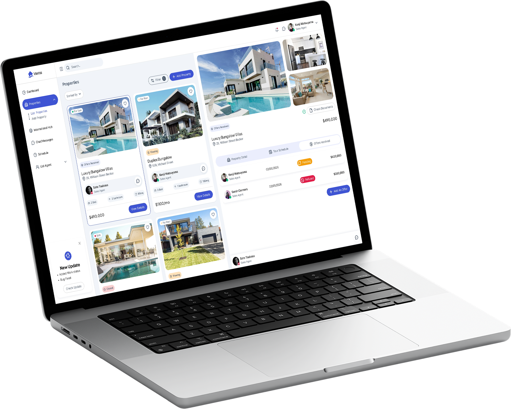

The lack of a clear, immediate, and shared view of property statuses and documentation created severe communication chaos, slowing down negotiations.

Define a shared visual and communication standard for property management, improving coordination and collaboration across colleagues and branches.

UX/UI Lead & Front-End Developer. I led the entire product lifecycle: from user research and interface design to translating components into clean, scalable code.

Field research was conducted by interviewing key stakeholders. Before this research, my assumptions centered around displaying sales growth and purchase metrics on a dashboard. However, listening to real users fundamentally shifted my perspective: I realized I needed to design something that protected the core relationship between consultant and client.
My authority with clients depends on the completeness of the information I hold. If the process is seamless, the sale is secure.
Kenji is a Senior Consultant with over 15 years of experience in real estate. He needs a CRM that provides a clear, immediate, and shared view of property statuses and required paperwork so he can coordinate efficiently with colleagues and branches. Without this information, he wastes hours on redundant phone calls and emails, slowing down decision-making and risking the quality and trust of his client consulting.


This User Journey Map analyzes the path Kenji navigates daily when contacted by a client for a new inquiry.
The objective was to map every phase of the process starting from initial contact, identifying key steps and primary friction points Kenji encounters through to deal closing and visit scheduling.
After selecting initial features and concepts, an overarching review was conducted to determine which ideas to retain and which to discard.
Through this synthesis, the most effective features were selected, including:
- Document tracking and status validation
- Assigned property lead and contextual chat
- Real-time property management (including visit slot reservations and offer tracking)
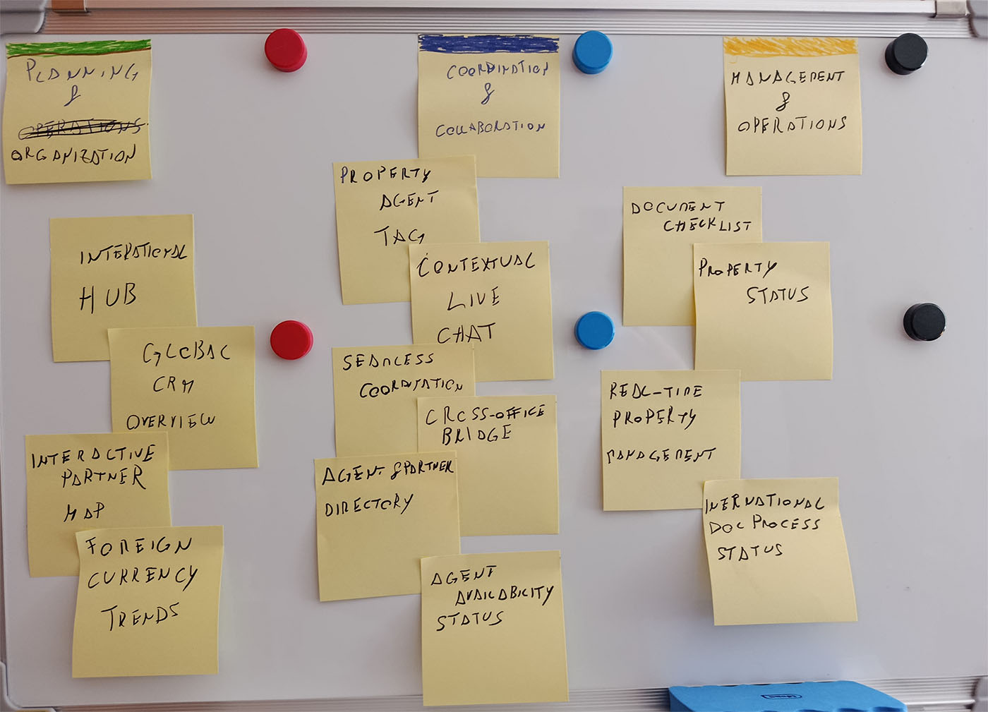
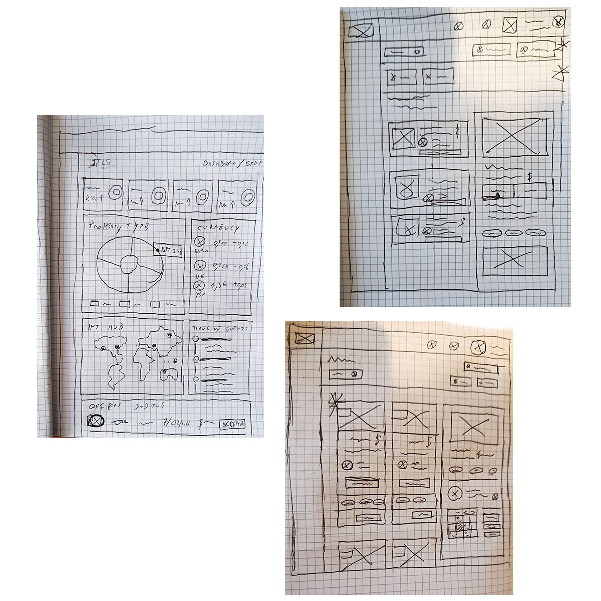
Paper/Digital Wireframes & Usability Testing.
In this early design phase, the primary focus was strictly on layout and structure. I intentionally kept a minimal style, isolating key sections to incorporate into subsequent iterations.

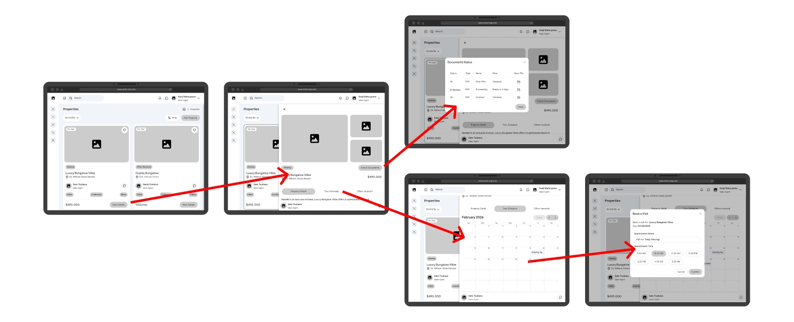
In this digital wireframe, the user gains instant clarity regarding property status via clear status badges (e.g., Viewing Open, Under Negotiation).
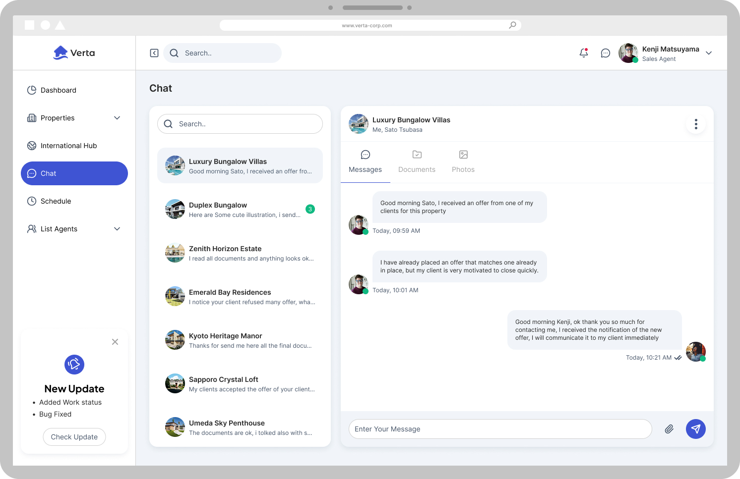
The assigned property agent is immediately visible, with an option to reach out rapidly through contextual chat.
Selecting a property opens its detailed view within a single interface, eliminating navigation lag.
Users can easily monitor documents using a single CTA that opens a dedicated audit modal.
The tabbed area serves as the engine of the experience: beyond viewing details, agents can autonomously manage appointment slots for viewing tours and track incoming offers.

We prototyped an interaction designed to highlight Kenji’s expertise, enhancing client care, schedule adherence, and team coordination.
The prototype test validated the flow's stability while revealing key insights to refine the design.
All participants involved in the test successfully completed the requested tasks.
Participants expressed high satisfaction and confidence, highlighting the fluidity and ease of overall property management.
User interviews highlighted the need to enrich the appointment booking modal. A majority of participants requested:
- More explicit and recognizable client naming.
- A visual thumbnail/photo of the target property within the modal.
- An input field to add the client’s phone number for whom the visit is being booked.
Mockups & Interactive Prototype.
This mockup displays the complete, refined UI for managing viewings within the property tab, allowing agents to instantly view open dates and available time slots.
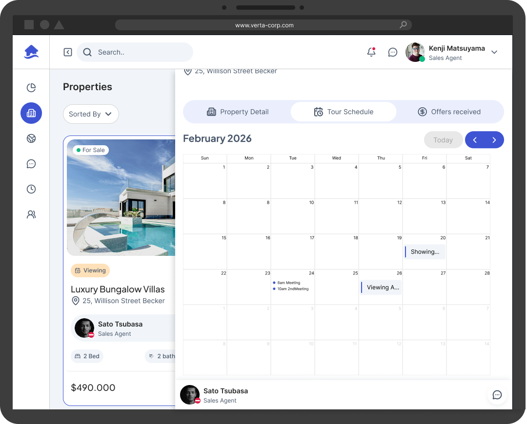
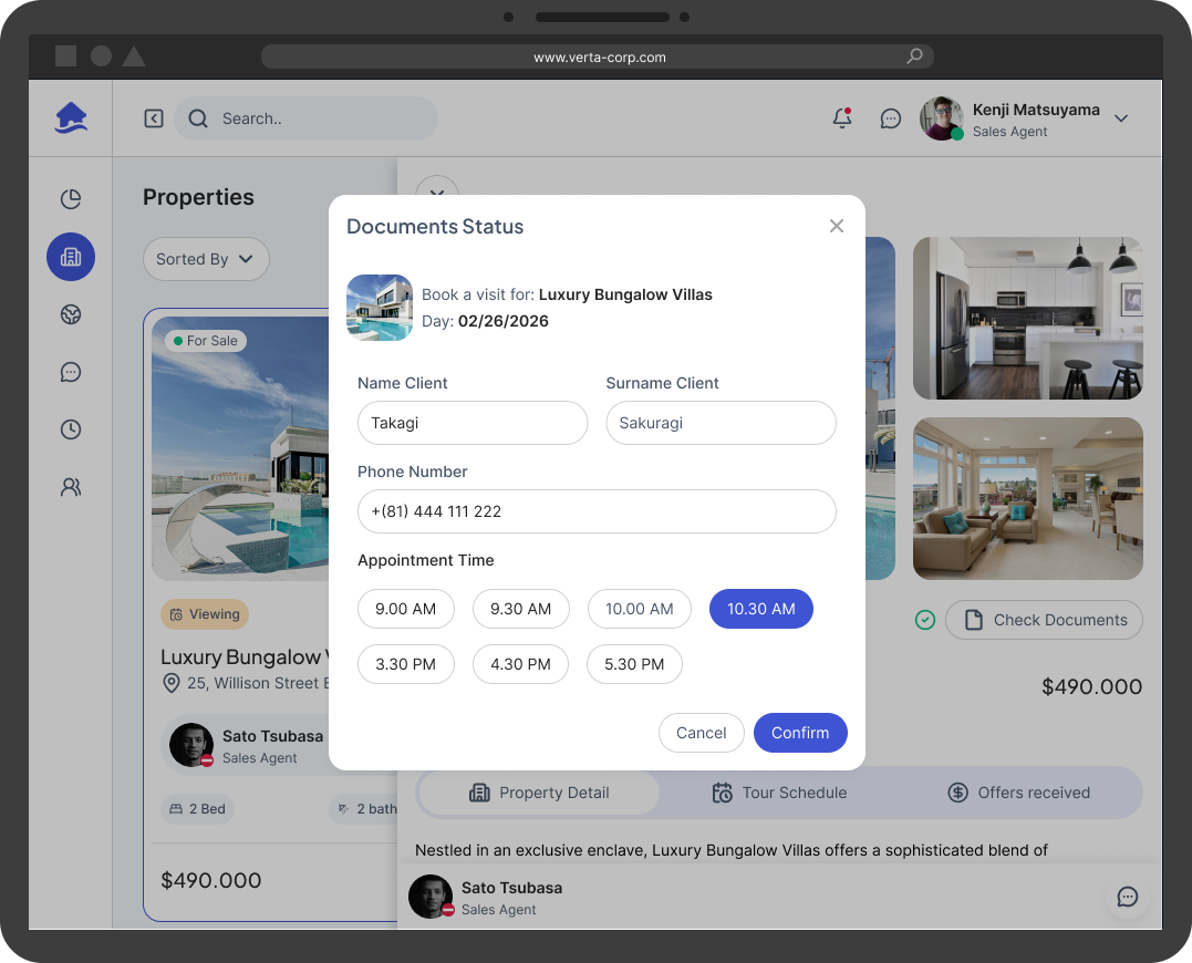
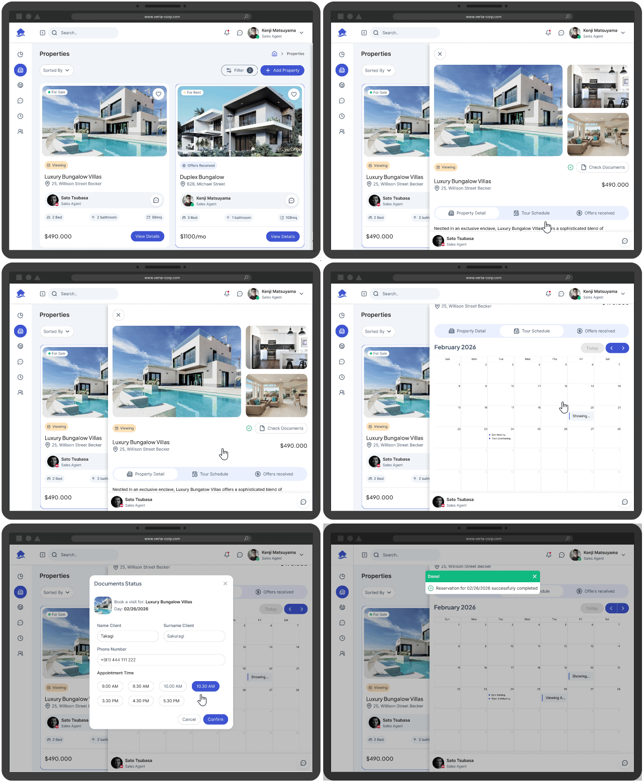
Improved design following usability test feedback. Redesigned to include clear user naming, a property preview image, and a dedicated input field for the client’s phone number.
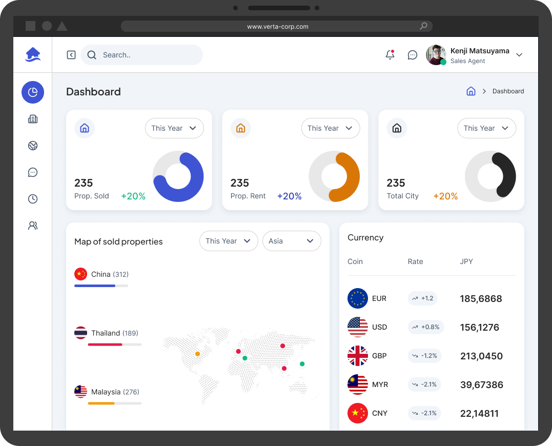
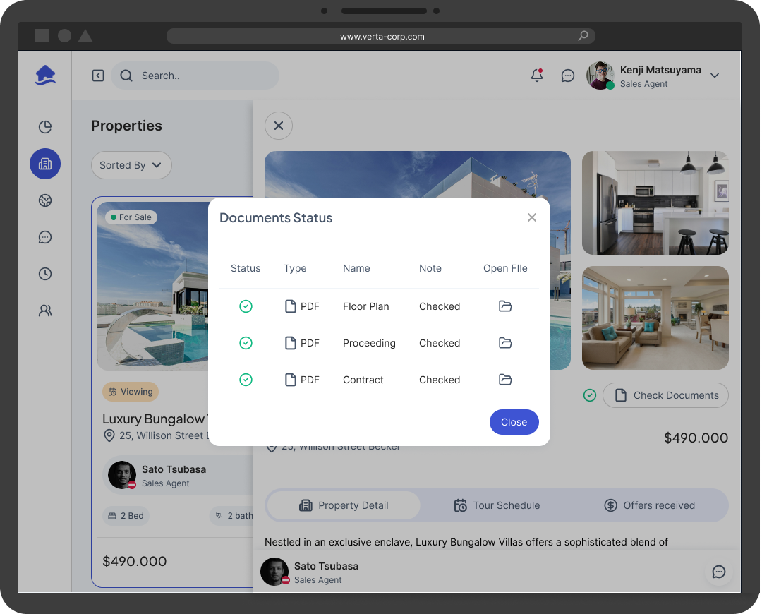
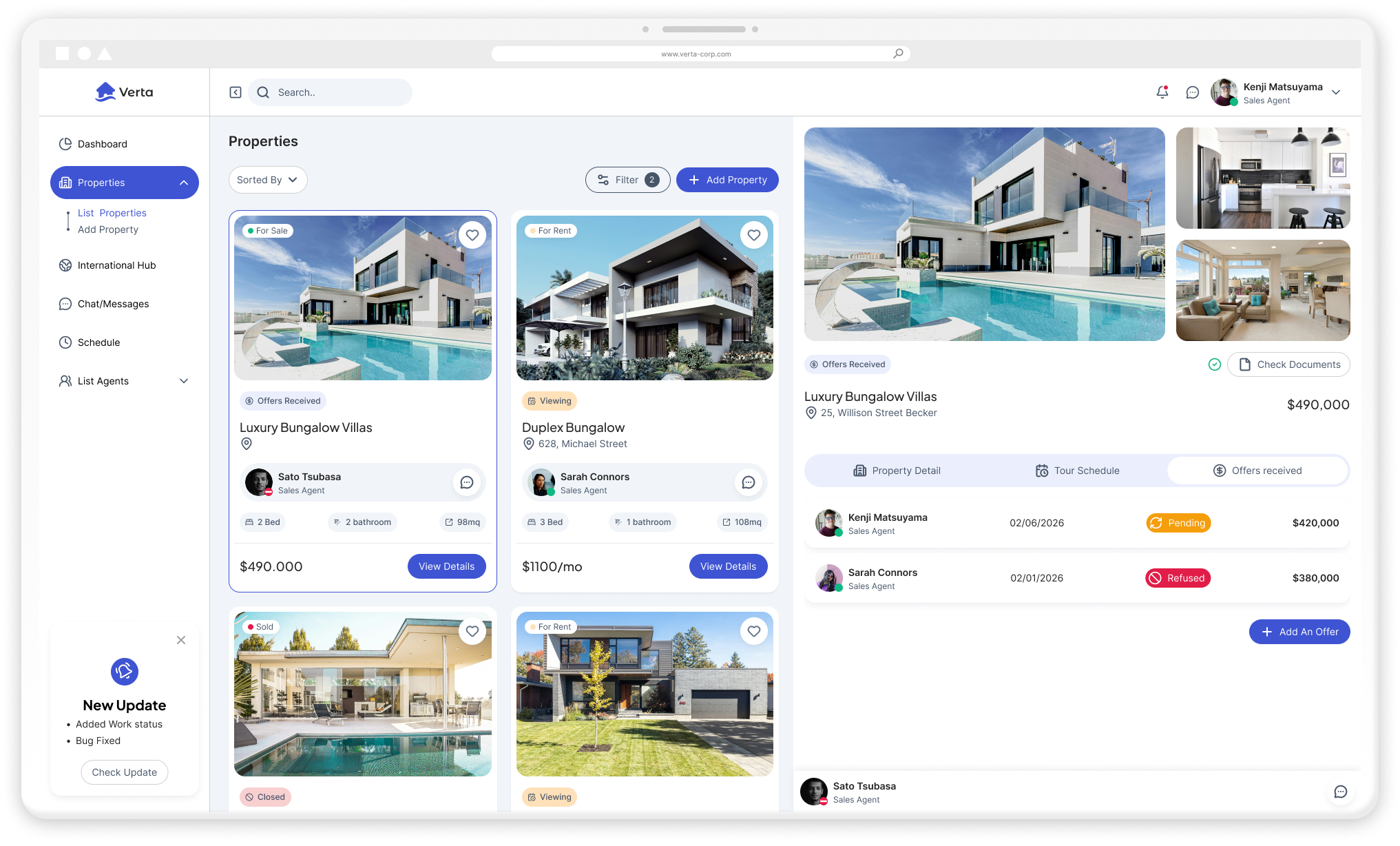
The interactive prototype demonstrates the complete property selection workflow. The initial overview highlights status badges (Viewing Open); once the detail sheet opens, Kenji can instantly check document validation.
Leveraging the tab system, users can book a viewing for their client in just a few clicks. The tab remains the core hub, allowing agents to manage appointment slots and track received offers seamlessly.
Coordination & Transparency: Real-time operational tracking minimized internal conflicts and boosted transparency across properties. Consultants immediately know who manages a listing and its exact status.
Reduced Communication Overhead: Integrating contextual chat directly into property sheets reduced constant reliance on emails and phone calls, centralizing information right where it is needed.
Focus on Quality Consulting: By eliminating idle time and data fragmentation, agents shifted their core focus away from administrative friction and back toward delivering high-quality client consulting.
This project presented meaningful challenges and reinforced that product quality relies on continuous iteration. I repeatedly consulted users whenever flows felt unclear.
Was it a flawless path? Not at all. If I could re-approach it with additional time and resources, I would expand the research scope. Rather than focusing solely on real estate agents (the direct software operators), I would dedicate a research phase to the agency's end clients. Understanding their expectations during site visits would have enabled an even more holistic, end-to-end design for the entire real estate ecosystem.